Oil painting styles explained: a guide for artists and collectors
Ask five people to describe an oil painting and you will get five different answers: one will talk about a dark, dramatic portrait, another about a hazy garden in bright colour, a third about a huge field of paint with no subject at all. All of them are right, because “oil painting” names a material, not a style. The style is what the painter does with it.
This guide explains what makes oil paint special, then walks through four styles that shaped how oil paintings look today. It ends with a practical question for any working artist: how do you describe your own style honestly, without borrowing a label that does not fit?
What makes oil paint different
Tate describes oil paint as a slow-drying paint made of pigment particles suspended in a drying oil, most commonly linseed, which hardens into a tough, coloured film when it meets the air. A heavily diluted layer is tack-free in a few days, while thicker layers take longer, and the paint keeps hardening with age over many decades.
That slow drying is the whole story. It lets a painter blend colours smoothly, rework an area, and build a picture up gradually. Tate notes that oil paints blend well with each other, which makes subtle variations of colour possible and details of light and shadow easier to create. Almost every style below is a different answer to one question: what do you do with paint that stays workable?
Baroque and chiaroscuro: drama made from light
Tate calls Baroque the dominant style of seventeenth-century art, marked by self-confidence, movement and realism, and at its height in Rome between about 1630 and 1680. Its aim was direct emotional appeal: scenes that feel like real events happening in front of you.
One of its favourite tools is chiaroscuro, an Italian word meaning “light-dark”. Tate defines it as the balance and pattern of light and shade in a picture, and says it is generally remarked upon when it is a prominent feature, usually when the artist uses extreme contrasts. A single lit figure against a dark ground is the classic version.
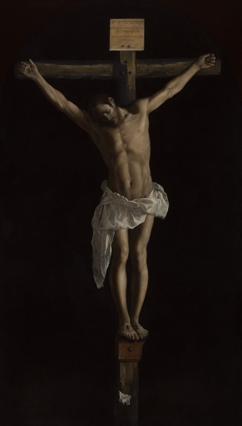
You can see the effect in Francisco de Zurbarán’s “The Crucifixion” (1627), in the collection of the Art Institute of Chicago. The Art Institute records that it was commissioned by a Dominican monastery in Seville, where it hung in a dimly lit space and was seen through a grill, and that early writers praised its sense of three-dimensionality, as if it were a sculpture. Christ is dramatically lit against a dark, empty background. Painting that makes a flat canvas feel solid is a skill oil paint was made for.
If your own work leans on strong contrasts of light and dark, this is the tradition you are working in, whatever your subject.
Realism: ordinary life, painted frankly
Realism arrived in the mid-nineteenth century. According to Tate, the French novelist Champfleury coined the name in the 1840s, and the painter most closely linked with it is Gustave Courbet. Realists took their subjects from everyday life, including peasant and working-class life, city streets and cafés, and painted them in a naturalistic way. Tate says this moved attention to subjects outside the high art tradition, where history painting and the grand manner had long dominated, and that the new subject matter shocked the mostly upper- and middle-class audiences for art.
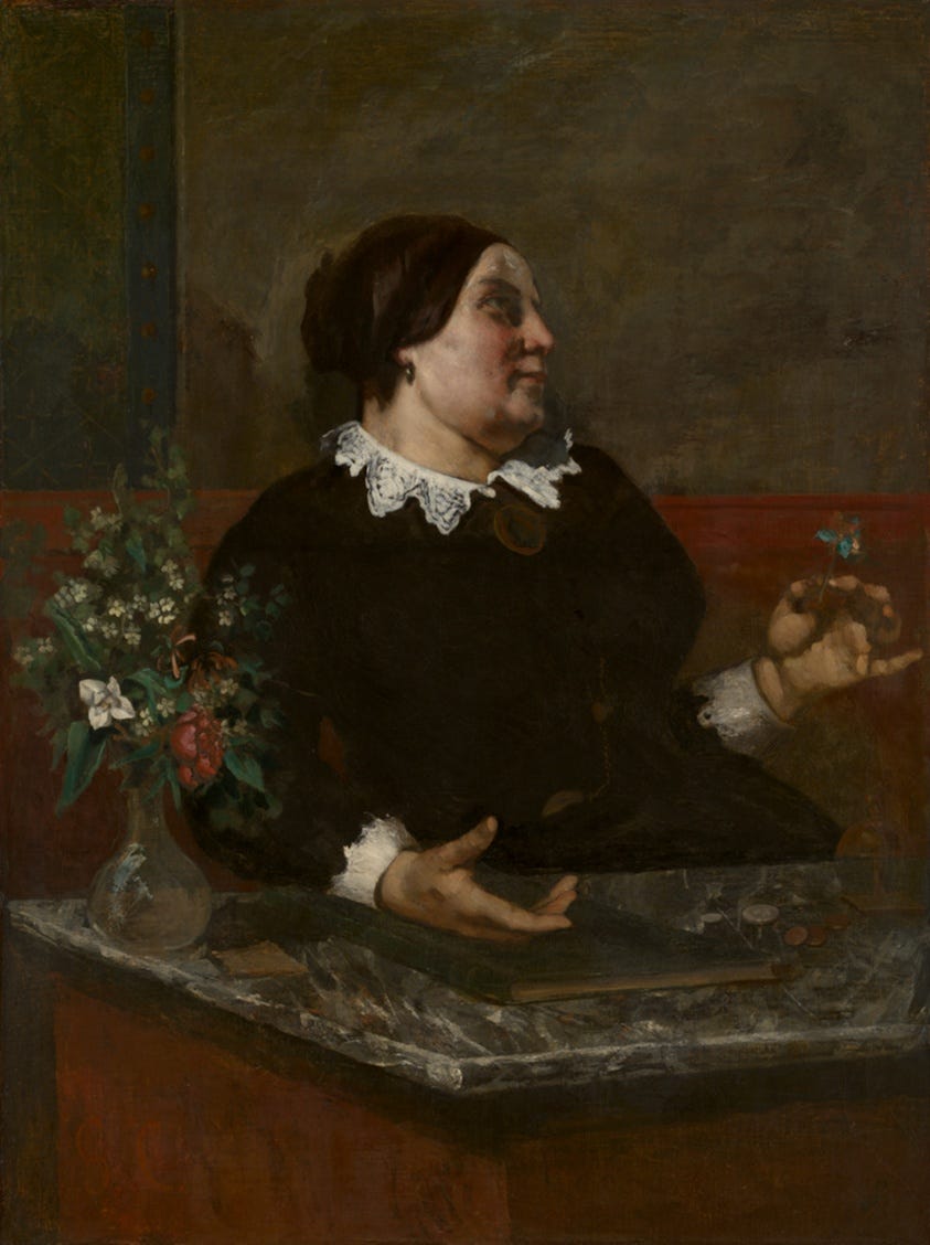
Courbet’s “Mère Grégoire” (1855, reworked 1857 to 1859), also in the Art Institute of Chicago, is an oil on canvas measuring 129 x 97.5 cm. The museum says its title character comes from a satirical 1820s song by the poet Pierre-Jean de Béranger, and that some read the flower she holds, in the colours of the French flag, as a protest against government censorship under the Second Empire.
Realism today is often used more loosely, for any sharply focused, almost photographic picture, whatever the subject. That is worth knowing before you use the word: a buyer might expect a precise likeness, while an art historian is thinking of a mid-nineteenth-century movement.
Impressionism: painting what light does
Impressionism was developed from the early 1860s by Claude Monet and other Paris-based artists. Tate says they painted finished pictures outdoors, on the spot, rather than in a studio, working quickly to catch the changing effects of sunlight. The brushwork was rapid and broken into separate dabs, and the subjects were mostly landscapes and scenes of everyday life. The name began as an insult: Monet’s “Impression, Sunrise” was singled out for ridicule at the first group exhibition in Paris in 1874, and critics used the name against the movement.
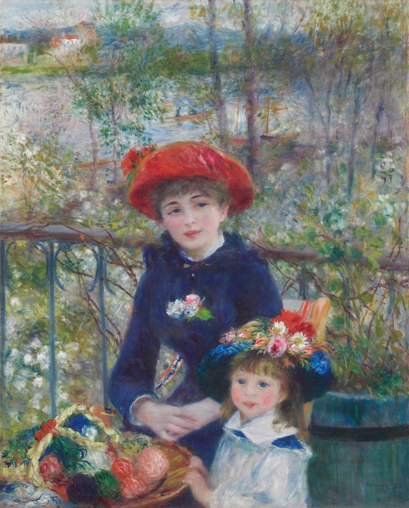
Pierre-Auguste Renoir was one of the group. His “Two Sisters (On the Terrace)” (1881), an oil on canvas of 100.4 x 80.9 cm in the Art Institute of Chicago, shows two women on a restaurant terrace by the river, the kind of everyday scene Tate describes. The Art Institute notes they are not really sisters: Renoir used paid models.
Oil paint suits this approach because a fresh dab can be laid next to another before either has dried. If you paint outdoors and care more about light and atmosphere than about outline, Impressionism is the nearest tradition to your own.
Abstract expressionism: paint as the subject
Tate dates Abstract Expressionism to the 1940s and 1950s and places it mainly in New York, which is why it is also called the New York school. Its leading figures included Jackson Pollock, Willem de Kooning, Mark Rothko, Barnett Newman and Clyfford Still. The work is abstract, aims to be expressive or emotional, and often shows gestural brushwork and “the impression of spontaneity”.
Tate describes two broad groups. Tate describes the action painters, led by Pollock and de Kooning, as attacking their canvases with expressive brush strokes. The colour field painters, Rothko, Newman and Still, filled their canvases with large areas of a single colour.
We have not shown an image for this style, because the best-known works are still under copyright and cannot be reproduced freely. A search of the artists’ names in any major museum’s online collection will show you the range.
Impasto: when the paint itself is the texture
One technique runs through several of these styles. Tate defines impasto as an area of thick paint or texture in a painting. It appeared first among the Venetian Renaissance painters Titian and Tintoretto, then in Baroque work such as Rubens’s, and became increasingly notable in nineteenth-century landscape, naturalist and romantic painting. In modern art, Tate says, it became “more or less compulsory”, as artists began to treat the painted surface as having its own physical presence. Tate adds that a painting where impasto is prominent can be called “painterly”, and that the texture and marks of the brush can carry emotion, rather like handwriting.
For an artist, impasto raises practical questions about photographing the work (raking light shows the texture) and about drying and care, because thick paint takes longer to harden.
How to name your own style
Most working painters do not belong neatly to one movement. A useful approach has three steps:
Describe what you do before you name it. Write one sentence about your subject, your colour and your brushwork, as if to someone who cannot see the picture.
Borrow a term only if it fits that sentence. “Realist” for a loose, expressive landscape will confuse buyers, while “painterly landscape in oil” tells them what to expect.
Name a tradition as an influence, not a label. “Influenced by the Impressionists’ use of broken colour” is honest and specific. “An Impressionist” is a claim you may not want to defend.
Whatever words you choose, use them the same way on your website, your labels and your price list. Consistent language helps buyers understand your work and helps search engines and AI tools understand what you make. For the wider picture of which traditional styles are selling in the UK right now, see our article on what traditional art styles are trending.
If you would like a starting price range for an original oil painting of your own, our free tool gives you one in about 30 seconds. It is a guide to the market, not a formal appraisal.
Where to go next
Curious which styles are selling now? See what traditional art styles are trending in the UK.
Want to price an oil painting in your style? Read how much is my oil painting worth.
Want a formula for your price? See our practical guide to pricing oil paintings.
References
Tate, “Oil paint”: https://www.tate.org.uk/art/art-terms/o/oil-paint
Tate, “Baroque”: https://www.tate.org.uk/art/art-terms/b/baroque
Tate, “Chiaroscuro”: https://www.tate.org.uk/art/art-terms/c/chiaroscuro
Tate, “Realism”: https://www.tate.org.uk/art/art-terms/r/realism
Tate, “Impressionism”: https://www.tate.org.uk/art/art-terms/i/impressionism
Tate, “Abstract expressionism”: https://www.tate.org.uk/art/art-terms/a/abstract-expressionism
Tate, “Impasto”: https://www.tate.org.uk/art/art-terms/i/impasto
Art Institute of Chicago, Zurbarán “The Crucifixion” (80084), Courbet “Mère Grégoire” (4428), Renoir “Two Sisters (On the Terrace)” (14655): https://www.artic.edu/artworks/80084 , https://www.artic.edu/artworks/4428 , https://www.artic.edu/artworks/14655
Made with love by artists, for artists 🫶🏼
info@priceyourpainting.com | www.priceyourpainting.com | Instagram